> ## Documentation Index
> Fetch the complete documentation index at: https://zodaf.mintlify.site/llms.txt
> Use this file to discover all available pages before exploring further.
# Complete Usage
> Learn how to use all zodaf auto-form features for more advanced use cases
## Introduction
### Create form instance
For this tutorial, we will start from a basic zodaf form example, to learn how to create a basic zodaf from, please refer to the [Basic Usage](/usage/basic-usage) guide.
```tsx app/page.tsx theme={null}
import { z } from "zod";
import { useAutoForm, AutoForm } from "@zodaf/react";
const schema = z.object({
name: z.string().describe("Your full name"),
email: z.string().email().describe("Your email address"),
age: z.number().int().min(18).describe("Your age"),
});
export default function Page() {
const form = useAutoForm(schema);
return ;
}
```
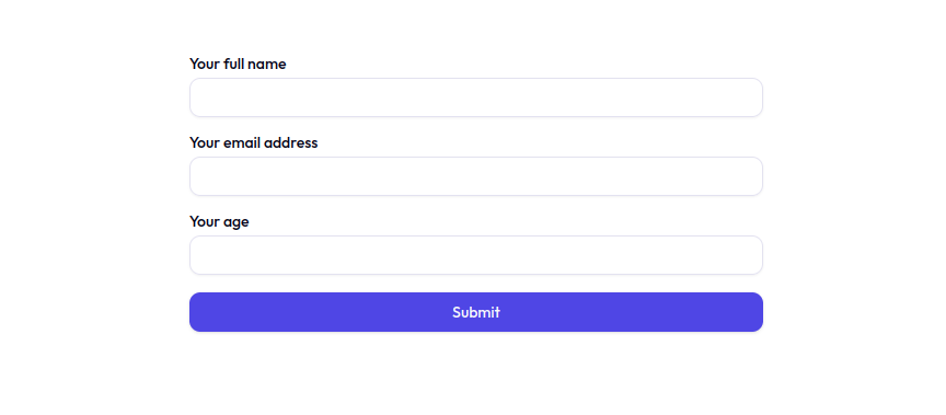 ## Basic Features
### Customizing form fields
You can easily customize form fields by passing a `config` object to the `useAutoForm` function. The `config` can take the following properties:
Object that defines the form fields configuration. The key is the field name and the value is a `ZodafFieldConfig` object.
Example:
```jsx theme={null}
const fieldsConfig = {
name: {
label: "Your full name",
placeholder: "John Doe",
},
email: {
description: "Your email must be unique",
fieldType: "email-with-auto-complete",
},
age: {
label: "Age",
placeholder: "Enter your age",
disabled: true,
props: {
className: "bg-gray-100",
},
},
};
const form = useAutoForm(schema, { fieldsConfig });
```
See the [configuration](/configuration/configuration) section for more details.
### Handling form events
Function that is called when the form is submitted. The function receives
the type-safe form data as an argument.
Example:
```jsx theme={null}
const onSubmit = (data) => {
console.log(data);
};
const form = useAutoForm(schema, { onSubmit });
```
Function that is called when the form has changes. The function receives
the type-safe form data as an argument.
Example:
```jsx theme={null}
const onChange = (data) => {
console.log(data);
};
const form = useAutoForm(schema, { onChange });
```
Label for the submit button.
Example:
```jsx theme={null}
const form = useAutoForm(schema, { submitLabel: "Save" });
```
**Note**: Ensure that the submitLabel is used with a submit component that
supports a children prop.
Hide the submit button.
Defaults to `false`.
Example:
```jsx theme={null}
const form = useAutoForm(schema, { submitHidden: true });
```
> Component will render without a submit button.
## Basic Features
### Customizing form fields
You can easily customize form fields by passing a `config` object to the `useAutoForm` function. The `config` can take the following properties:
Object that defines the form fields configuration. The key is the field name and the value is a `ZodafFieldConfig` object.
Example:
```jsx theme={null}
const fieldsConfig = {
name: {
label: "Your full name",
placeholder: "John Doe",
},
email: {
description: "Your email must be unique",
fieldType: "email-with-auto-complete",
},
age: {
label: "Age",
placeholder: "Enter your age",
disabled: true,
props: {
className: "bg-gray-100",
},
},
};
const form = useAutoForm(schema, { fieldsConfig });
```
See the [configuration](/configuration/configuration) section for more details.
### Handling form events
Function that is called when the form is submitted. The function receives
the type-safe form data as an argument.
Example:
```jsx theme={null}
const onSubmit = (data) => {
console.log(data);
};
const form = useAutoForm(schema, { onSubmit });
```
Function that is called when the form has changes. The function receives
the type-safe form data as an argument.
Example:
```jsx theme={null}
const onChange = (data) => {
console.log(data);
};
const form = useAutoForm(schema, { onChange });
```
Label for the submit button.
Example:
```jsx theme={null}
const form = useAutoForm(schema, { submitLabel: "Save" });
```
**Note**: Ensure that the submitLabel is used with a submit component that
supports a children prop.
Hide the submit button.
Defaults to `false`.
Example:
```jsx theme={null}
const form = useAutoForm(schema, { submitHidden: true });
```
> Component will render without a submit button.